In 2004, the original Roblox logo was designed by the company’s co-founders David Baszucki and Erik Cassel. The insignia combining nearly 10 colors suggested something fun and creative. That was only the beginning of a series of highly memorable logos. Well, now, let us talk about the meaning and history of the Roblox logo.
Meaning and history of Roblox Logo
The visual history of the popular online games brand consists of four main chapters, when the company changed its name four times during its existence, each time a completely different logo was introduced. Although with the name change to Roblox in the year of 2004, the redesigns have not finished. Since then, there have been more than ten different emblems made.
1989 — 1997
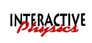
The initial logo was made while the company’s name was Interactive Physics. It featured a light blue rectangle with 2 wordmarks in different styles and colors. For Windows, Roblox utilized white “Interactive” and yellow “Physics” in a traditional serif font. Then, the wordmarks were placed in one line with no space between them. For Mac, the brand logo was a little different. Two wordmarks were placed one above another on a blue background, with the “Interactive” lettering in all capitals of a modern sans-serif typeface and “Physics” in red bold cursive.
2003
In 2003, the GoBlocks appeared, and its logo was composed of a simple inscription with “Go” in green and “Blocks” in dark blue placed close to each other and accompanied by “Alpha” in the lowercase on its right.
2003 — 2004
Later in the same year, Roblox platform was renamed DynaBlocks, and its new emblem featured a bold sans-serif inscription where each letter featured one of the following shades: red, blue, green, orange, lime, light blue, and purple. The wordmark was complemented by a solid dot. And “Beta” in lightweight sans-serif.
2004
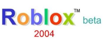
In 2004, the name of Roblox was introduced, with the new logo that was composed of a strict shadowed sans-serif inscription in the title case with each letter colored in its shade. The Roblox logo was light and friendly however only stayed with the company for several months.
2004 — 2005
The new badge was made in 1004. It was a strong design, where the logotype in sans serif typeface was executed in gradient blue and white, and then outlined in red. The letter “X” was composed of 2 arrowheads pointing one against another.
2005 — 2006
In 2005, the letters were switched to uppercase. Their contours were refined and softened. The new typeface looked more progressive. The color palette, which remained unchanged, boosts a sense of the creativity and professionalism.
2006 — 2009
The new era of visual identity started for Roblox in the year of 2006. The new logo was executed in red and white, and looks fresh and edgy, evoking a sense of playfulness and passion. The extra-bold letters of wordmark were executed in a cartoonish handwritten type, and outlines in red, overlapping each other.
2007 — 2010
In the year of 2007, the lines of the logotype were slightly refined and softened, as well as the color palette, the red of the outline became one shade lighter. This version was utilized as a secondary one for the next two years.
2010 — 2015
The redesign of Roblox logo in 2010 emboldened the outline of the emblem and added several dark red gradients to make the badge more voluminous and dynamic. The angles of the letters got softened, even though it did not affect the strength and solidness of the wordmark.
2014 (unused)
In 2014, another version of Roblox logo was made, although it has never been used. Also, it was a white and red inscription, however with a new typeface. The letters were placed in one straight line with no gaps and jumps.
2015 — 2017
In the year of 2015, Roblox platform modified its logo version of 2010, lightening up the outline and creating it thinner. Aside from that, there was an additional version of the badge with a Powering Imagination tagline in gray sans serif placed under the main inscription.
2017 — 2018
Another version of the Roblox logo was designed in 2017. It had a red inscription, where a letter “O” was drawn as the squares, and the first one was placed diagonally, inclined to the right. Occasionally, the “Powering Imagination” tagline was used under the logo, written in black.
2018 — Today
In 2018, the previous version of the emblem was simplified and strengthened, by switching the color palette to monochrome and removing the tagline. Now, the black lettering looks more confident than ever and the diagonally placed square replacing the first letter “O” in the nameplate creates the strict logotype playful and welcoming.
Font of Roblox Logo
The typeface for the Roblox logo has been made from scratch. The most unusual letter is arguably the first “O” that looks like a tilted box. Also, the second “O” has a unique shape resembling a box. All other letters belong to a solid sans-serif type with a slight retro feel.
Color of Roblox Logo
The color scheme of the Roblox logo, including only red and white, looks bright and vivid.
Icon of Roblox
Icon of Roblox is a perfect graphical representation of a strong and confident label name. There is something powerful and geometric in the sound of the online gaming platform. And its simple bold icon is a brilliant reflection of it.
The Roblox icon is a slanted square, standing for the first letter “O” in the logo of the label. Executed whether in black or red, it was a smaller white square in the middle. The inclination to the right and diagonal disposition of the strict square shape icon boosts a sense of playfulness along with progressiveness and motion. The straight lines and sharp angles of the icon represent the stability and professionalism, and the color palette adds such qualities as determination and power.
The Roblox icon is a true example of how simplicity will be able to work better than any ornaments and complicated compositions.
AUTHOR BIO
On my daily job, I am a software engineer, programmer & computer technician. My passion is assembling PC hardware, studying Operating System and all things related to computers technology. I also love to make short films for YouTube as a producer. More at about me…




![Roblox Greenville [Auto Farm] Scripts](https://www.alfintechcomputer.com/wp-content/uploads/2025/08/Roblox-Greenville-Auto-Farm-Scripts-450x240.jpg)


![Roblox Universal Script [Noclip]](https://www.alfintechcomputer.com/wp-content/uploads/2025/03/Roblox-Universal-Script-Noclip-450x240.jpg)


